
Visualizing COVID-19 Statistics
Introduction
Since early January, the developing case of acute respiratory syndrome causing virus: COVID-19, or ncov-19 as it was known at the time, caught my easily distractable attention. I was not only worried of the disease's pathological features, but its impact on the society in many other ways. Therefore, I wanted to track the development of COVID-19 with graphs that and compare the disease development over time between different countries. Handfully, even early on, there was COVID-19 Dashboard by the Center for Systems Science and Engineering (CSSE) at Johns Hopkins University (JHU), which presented marvelous overview of the disease spread. However, it didn't sufficiently compare disease development over time between different countries the way I preferred, but presented this slow to load graph of the world map with disease cases for each country.
Worldometer website provided a quick and fast update for each country's COVID-19 situation. However, it didn't sufficiently compare countries' development of COVID-19 cases over time. This determined me to make my own solution for visualizing COVID-19 statistical data, where I could pick and choose different countries COVID-19 case and death statistics to compare. I looked for regularly updated, openly available COVID-19 datasets. Eventually I found ECDC's geographic distribution of COVID-19 cases worldwide, which contains new COVID-19 cases and deaths each day for each country in the world. This dataset was updated daily, so it was really in keeping up to date with developing COVID-19 situation.
Graphical visualizations
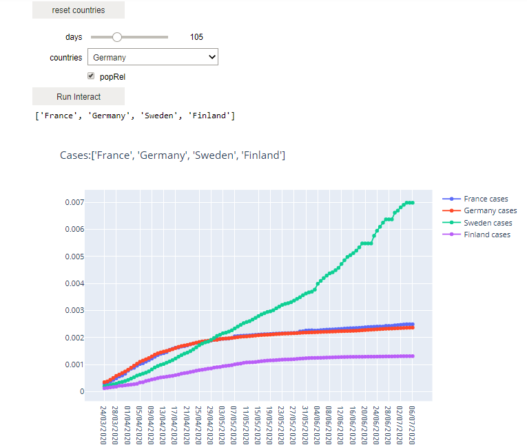
I used Plotly module for Python to visualize the COVID-19 statistic data, since it makes nice and interactive graphs, that can be especially useful for 3D plots if one would like turn or zoom to inspect the graph more closely. First, I wanted a simple linegraph that presented different countries' cumulative increase of COVID-19 cases and deaths. I also wanted an user interface where I could pick countries to compare, so I utilized Jupyter notebook's widgets feature to create one:
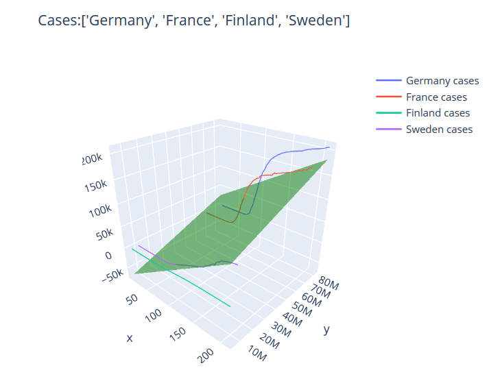
This wasn't enough for me however, I wanted to also see the relationship between population size and cumulative increase in COVID-19 cases and deaths over time. Therefore, I created 3D graph that plotted these three features. Also, I added a multilinear model to visually express the relationship between these features:
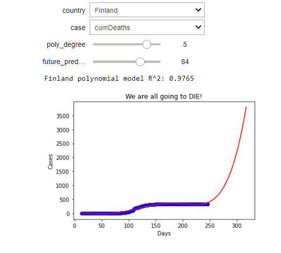
And finally, I wanted to try out polynomial model fitting, to see how higher degree polynomial models would predict case development for individual countries. The results were useless to say the least, but it was fun excercise:
Conclusion
All in all, I found comparing different countries COVID-19 fascinating. It was much easier to compare epidemiological data between countries and it was easier to see certain patterns that emerged simultaneously or in succession between countries in certain regions. One of these cases was the increase in COVID-19 cases at the start of the summer season when people started to spend more time outside and socialize, which was evident in most of Western Europe. However, even though this method may be a handy tool to compare different countries COVID-19 statistics, it doesn't take into account the differing ways some countries gather their data. Some may count COVID-19 deaths even though it may have been just a secondary or a tertiary factor to one's death. On the other hand, some countries may not gather any data or even omit statistical data for other political reasons.
Back to home page